I've given the game options a massive overhaul. In case you don't/can't remember what it looks like off by heart, here it is below;
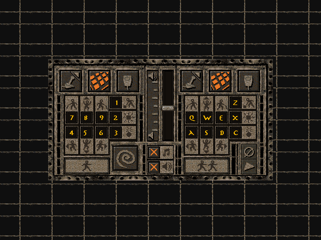
There are a few things that I find wrong with this dialog, most from just a quick glance, and I'm sure I'm not the only one who has them.
- the single and 2nd player controls are easy enough to see - they are on either side. The problem I have is the little Loder Guy icon in a nice heading box is dumped down the bottom where you look last. It doesn't look or stand out like a heading at all
- the player controls are split up by the revert/okay/cancel buttons which looks a little odd
- no other dialog in the game has main ok/cancel buttons that small
- on first glance it looks like the revert button is a part of single player controls
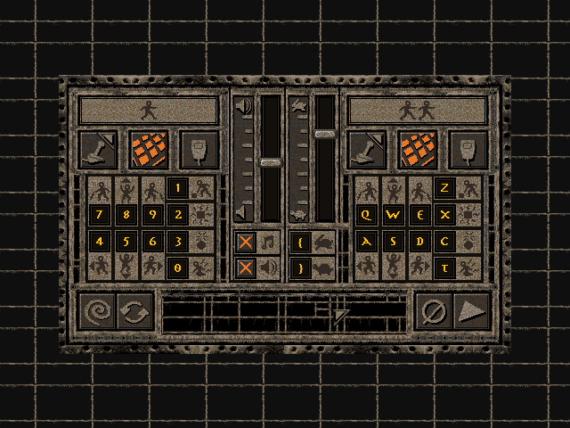
The updated game options dialog
As you can see from the reworked dialog above it looks similar to the old and more familiar with the other game dialogs. The main changes being;
- the header part is moved to the top where it makes more sense to be
- a speed slider control added with the ability to choose your own shortcut (as well as the previous F5 and F6)
- the action buttons have been made larger to match most other dialogs
- a "swap keys" button added;
- this button swaps the keys from player one with two and vice versa
- if you don't want player one keys to be the numpad and find the two player controls easier to use (from the left hand), you can swap them in one go without having to manually alter twenty controls
- credit for this feature goes to Adam - thanks Adam!
- kill player key added (in addition to the original shortcuts)
This is not the final dialog: there are some minor touch-ups to go and the turtle, hare and swap icons does need some more tweaking to make them match the original some more.
How did I do it?##
The same as any other dialog I create. I extract the original dialog, print+screen a shot from the original game and then combine in MS Paint with other dialog elements until I'm happy. F11 gets a workout. Once my brother signs off on it all, I start from scratch but with far more care.
The dialog you see above took me approx. four hours in MS Paint to get right and four hours on and off to get it into the game and working. This is the third options dialog design totalling approx. 24 hours over the last few months + contributing to quite a lot of Desktop clutter.
Don't like the new dialog? Let me know, I'm willing to make changes.