Here are the latest round of changes I've made to the original. Like all previous changes, these are only cosmetic and finish off what seems incomplete in the original.
Big bombs
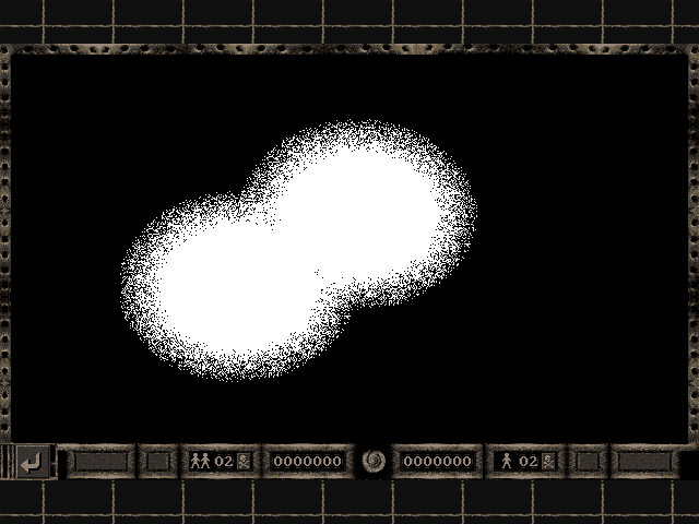
Diehard fans may have noticed a slight discrepancy with the way the Big Bomb explodes. With small bombs, the first frame of the explosion has the bomb with the fuse burned down completely. The problem is, this same animation is recycled for big bombs too.
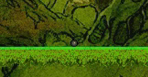
The first frame of a small bomb exploding
This is nothing major but if you look at the GIF animation below you can clearly see it looks silly; the big bomb suddenly shrinks to a fraction of the size - they don't even look alike either. This was one of the little things that stand out in the original that I consider to be more of a flaw.
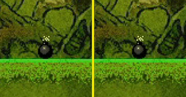
The original on the LEFT and the tweaked version on the RIGHT
The fix was simple; just draw a portion of the bomb without a fuse over the top of the first frame of the explosion. As you can see above, it looks a lot nicer!
Don't be afraid of the dark
The darkness effect should be applied to all game modes but in the original, it's only visible for single player.
Like all of the other mods, this effect looks legit and required no additional art assets.
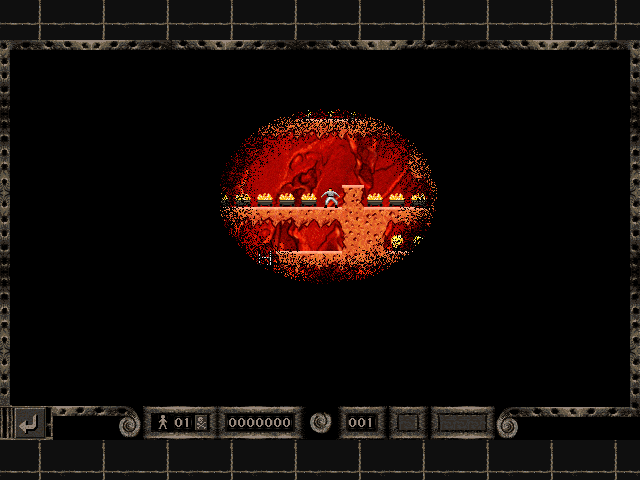
Original single player
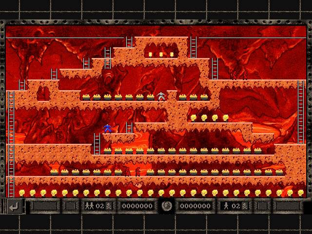
Darkness ignored in original two-player
I simply create a new mask by drawing Presage's original mask texture twice (once for each player) onto a RenderTarget and then use a basic pixel shader to draw this new mask over the puzzle.
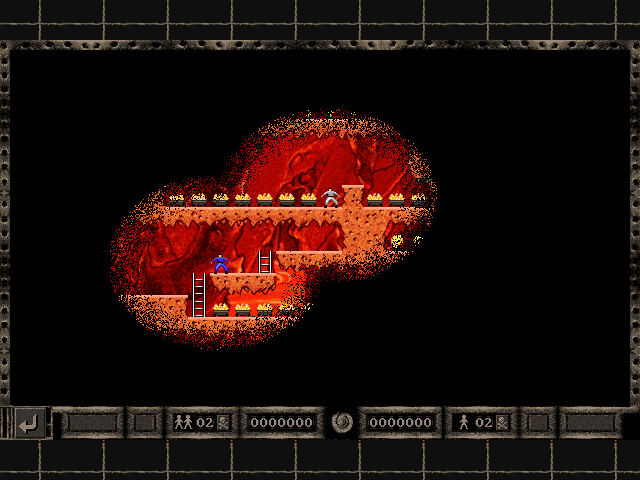
So pretty
It wasn't at all difficult to implement so I'm assuming Presage ran out of time?
Interface numbers
I doubt many would have noticed this in the original Mad Monks' Revenge - I didn't either until you are zooming in in MS Paint all the time - that the number boxes all have their digits aligned differently.
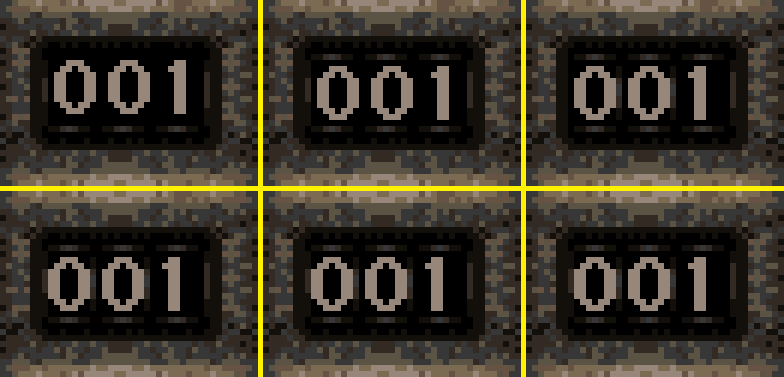
If you look at the above picture, the top row is the original, the bottom is the new one. The Left column is the puzzle number shown in the puzzle viewer, in the middle column is the puzzle number shown in the editor UI and the right column is the puzzle number in the actual game.
Notice how all align differently in the original?
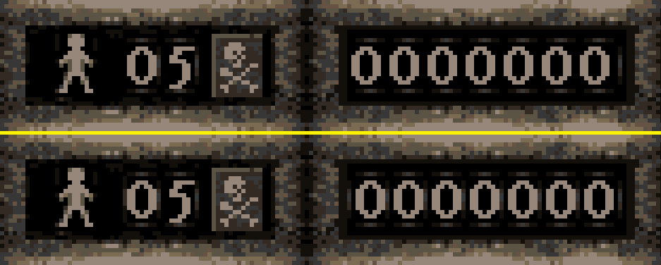
Top is the original; bottom is the fixed version
It's the same story with the lives and point boxes in the game. Not a major issue I know but it is something I can fix.